10 Lead Capture Page Examples Built to Convert
A lead page does not need to impress everyone. It needs to give the visitor who arrived from a specific ad, email, traffic source, or referral a clear reason to take one measurable next step. For marketers buying clicks or working with limited traffic volume, the best lead capture page examples are not design showcases. They are focused conversion assets with a message that matches the source, a low-friction form, and a follow-up path that starts immediately.
The examples below are patterns, not templates to copy word for word. Use the structure that fits the offer, traffic temperature, and level of trust your visitor needs before handing over contact information.
What a Lead Capture Page Must Do
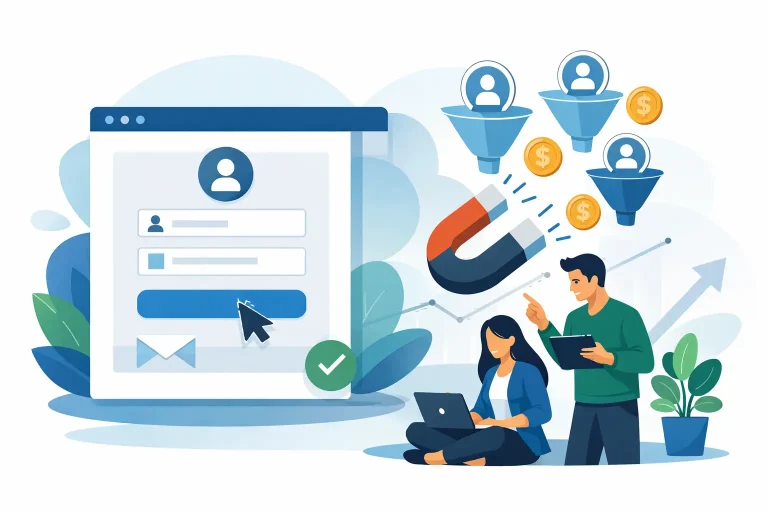
A capture page has one job: exchange enough perceived value for a visitor’s email address, phone number, or other permission-based contact detail. That means every major element should support the offer. Navigation, unrelated links, oversized explanations, and competing calls to action usually pull attention away from the form.
The trade-off is qualification. A very short page with an email-only form can produce more leads, but some may be poorly matched to the next offer. A longer page or an added qualifying field may reduce raw opt-ins while improving follow-up results. Neither approach is automatically better. Match the friction to the value of the lead and the traffic source you are using.
10 Lead Capture Page Examples for Campaign Traffic
1. The one-benefit email opt-in
This is the cleanest format for cold paid traffic, traffic exchanges, and broad interest targeting. The page leads with one specific outcome, such as a free checklist, deal alert, swipe file, or short training. Below the headline, include two or three lines that state what the visitor receives and why it is useful now.
The form asks only for an email address. The button copy should describe the result, not simply say “Submit.” “Send Me the Checklist” gives the visitor a clearer expectation. This format works when the offer is easy to understand in seconds. It underperforms when the promised resource sounds generic or the ad that sent the click made a different promise.
2. The curiosity-driven report page
A report page works when your audience already recognizes a problem but does not yet know the mechanism behind the solution. The headline can identify a costly mistake, overlooked tactic, or short window of opportunity. The copy then explains what the report reveals without giving away every detail.
Keep the curiosity grounded. Claims that sound inflated can bring opt-ins from incentive seekers, but they often damage email engagement and create more unsubscribes. State the subject clearly, name the intended reader, and use a realistic preview of what the report covers. One relevant cover image or document mockup can help make the download feel tangible.
3. The webinar registration page
For a live or recorded presentation, the page needs more logistical detail than a simple download page. Lead with the session topic and outcome, then state the date, time, duration, and whether a replay will be available. Visitors should know exactly what they are registering for before they see the form.
A strong webinar page also earns the right to ask for more than an email. First name is usually enough for basic personalization. Phone number can make sense for a higher-value appointment or sales process, but it is often unnecessary for a general training event. If the session is recorded, avoid fake urgency. Use real availability limits, not manufactured ones.
4. The quiz or assessment entry page
A quiz can convert well because it offers a personalized result rather than a static resource. The initial page should explain the payoff in plain language: find out which traffic channel fits your budget, identify the leak in your funnel, or receive a campaign readiness score.
Do not put the email form before the first question unless the audience already trusts you. Let visitors answer a few simple questions, then request their email before showing the full result. This creates commitment without requiring a long form at the start. Make sure the result is useful on its own. If every score leads to the same sales pitch, visitors will notice.
5. The free tool access page
Calculators, headline graders, budget planners, and tracking worksheets can produce high-intent leads because the visitor is actively trying to solve a current problem. The page should show the tool’s practical output, not just call it “free access.” A screenshot or short description of the result is usually more convincing than a feature list.
This format is especially useful for business-to-business offers and marketer audiences. The risk is that some visitors will use the tool once and never engage again. Plan a follow-up sequence that builds on the result they received. For example, send an interpretation guide, a case example, or the next tactical step within the first day.
6. The coupon or limited-offer page
Discount and bonus pages are direct-response staples. They work best when the visitor already understands the product category and needs a reason to act now. The capture offer might be a coupon code, early access notice, bonus bundle, or price-drop alert.
Be precise about the terms. If an offer requires a purchase, say so. If the bonus expires, show the actual deadline. A lead generated by confusion is not a useful lead. This format can grow a list quickly, but it tends to attract price-sensitive contacts, so do not assume coupon subscribers will respond to every future promotion.
7. The case study request page
When the offer involves a service, software, coaching, or higher-priced affiliate product, a case study can do more work than a generic lead magnet. The page should identify the starting condition, the action taken, and the measurable result. Specificity matters more than hype.
Use a short form and frame the request as access to the full breakdown. For warmer traffic, include a brief testimonial or relevant proof point near the form. Avoid using vague claims such as “massive growth.” Numbers, time frames, and context make the story more credible, even when the result is modest.
8. The waitlist page
A waitlist page captures demand before an offer is fully available. It is useful for upcoming courses, software releases, group programs, or limited promotions. The visitor should understand what is coming, when they can expect it, and what advantage they receive by joining early.
A waitlist is not an excuse for an empty page. Give a reason to care now: first access, founding pricing, a launch bonus, or a limited number of invitations. If the launch date is uncertain, say “expected” rather than presenting a firm deadline you may miss. Trust built before launch affects how the campaign performs when the offer opens.
9. The application or qualification page
Some campaigns should screen leads instead of maximizing form volume. An application page is appropriate for consultations, premium services, high-ticket offers, and partner opportunities. It asks visitors to provide information that helps determine fit, such as monthly budget, business stage, primary goal, or timeline.
This page needs stronger positioning than a basic opt-in. Explain who the opportunity is for and, just as importantly, who it is not for. That reduces unqualified submissions and sets expectations before a call or sales follow-up. Keep required questions practical. Asking for detailed financial information before trust exists will suppress completions.
10. The bridge page before an affiliate offer
A bridge page captures a lead before sending the visitor to a third-party offer. Rather than dropping paid or incentive-driven traffic directly onto an affiliate page, use the page to frame the offer, identify the audience it helps, and collect permission for follow-up.
The key is alignment. Your capture-page headline, button, and next-page destination must describe the same opportunity. Do not promise a free guide and immediately redirect to an unrelated sales page. A simple disclosure that you may receive compensation can also support trust, especially when the traffic source is cold. The bridge page should add context, not create a detour.
Build the Page Around the Traffic Source
The same offer may need different capture pages for different sources. A visitor from a short social post may need a faster explanation and a simple form. A visitor from a detailed email can handle a more specific page because the email already established context. Paid search visitors often respond best when the page repeats the problem and language used in the search intent.
For affiliate and promotion campaigns, track more than opt-in rate. Watch cost per lead, confirmation rate, email opens, clicks to the next offer, refunds, and downstream revenue. A page that converts at 45% is not automatically stronger than one that converts at 25%. If the lower-converting page produces subscribers who open, click, and buy, it may be the better campaign asset.
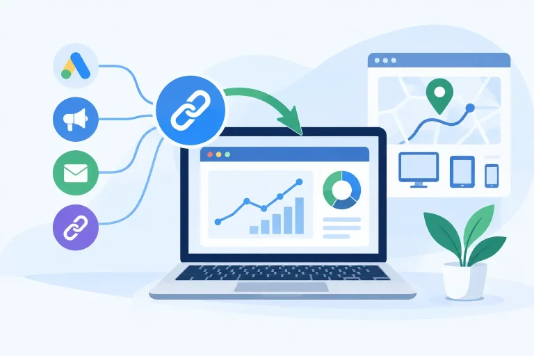
Use a dedicated hosted URL for each meaningful variation so you can isolate results. Change one major element at a time: the lead offer, headline angle, form length, or traffic-source message. When multiple elements change together, the data will not tell you what actually improved performance.
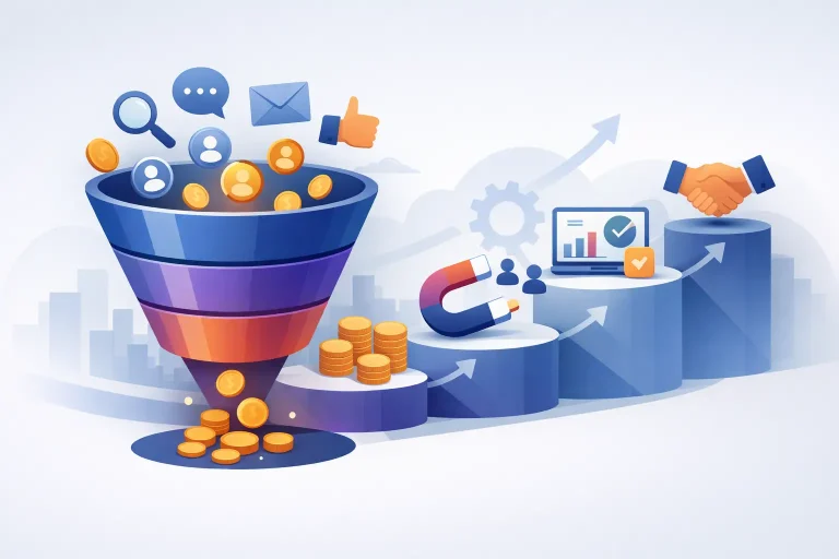
A capture page earns its place in your funnel when it makes the next action obvious and makes the follow-up relevant. Start with one offer, one audience segment, and one traffic source. Get that page producing measurable behavior before adding more design, more fields, or more claims.